The saying “two heads are better than one” is often true in the workplace. But what do you do when you have 20 heads trying to communicate?
Employee collaboration can have a strong influence on a company’s culture, productivity and innovation. According to a survey conducted by the Queens University of Charlotte, 39% of surveyed employees believe that people in their own organization don’t collaborate enough.
 Another study found that 86% of employees and executives cite lack of collaboration or ineffective communication for workplace failures.
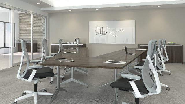
Rather than accepting the delays associated with an email chain, move to the conference room! But, keep in mind that your conference room is only as effective as its design allows. Be sure to avoid these 6 mistakes when designing a conference room in your office.
1) Carelessly Mounted Screen
For businesses of all sizes and types, it is important to strategically position the TV or projector screens in the conference room. Choose the best wall with regards to windows, angle and height. Each person in the conference room should be able to view the screen from where they’re sitting.
If the screen is mounted too low, attendees may not be able to see over the person next to or in front of them. And, don’t forget about glare control! Glare can be incredibly distracting and disrupt visual presentations. Ensure a pleasing visual experience for employees and visiting clients by incorporating blinds or curtains that can be used when necessary.
2) Uncomfortable Seating
Quality office chairs may not be cheap, but decreased performance due to uncomfortable and unfocused employees can be far more costly. Make sure your conference room seating is suitable for all shapes and sizes.
Chairs should be adjustable for height and offer sufficient back support. Comfort is key! Finding the perfect office chair for your conference room will help employees remain comfortable and stay focused.
3) Not Enough Power
Your conference room may have the right office furniture, but is there enough power to support your employees? Conference rooms should have plenty of power sources available. 20 people in a 1-hour, 2-hour or even longer meeting are going to need somewhere to charge their computers and devices.
Power sources should not only be on the walls. Power/data sources built into or running across the table top are convenient and eliminate the risk of tripping on cords running to the wall.
If you choose a conference table with an inlay of power/data sources, you’ll want any wires to be retractable and easily covered to maintain a neat and tidy room when not in use. Also, explore video conferencing tools and the necessary power sources.
4) Uncontrollable Lighting
The wrong lighting in a conference room, and in the office as a whole, can kill productivity. Employees that are fighting eye strain, headaches and poor concentration will not be able to perform to the best of their ability.
Therefore, your conference room should have adjustable lighting. You may need the lights to dim during a presentation, brighten the room up for a video conference or be somewhere in between depending on the weather outside. Natural lighting is best of course, but adaptable lighting is a must have for your conference room.
5) Limited Space
There are a variety of ways in which presenters engage with their audience. Some prefer to stand behind a podium. Others may opt to be seated while presenting.
There are also people that like to be on the move and walk around the room. You don’t want to cramp anyone’s style, so make sure that your conference room provides adequate space for each type of presenter to be effective.
6) Too Much Noise
The voice of an enthusiastic presenter, high volume of a conference call or multiple people collaborating can be disruptive to the rest of the office when the sound travels outside of the conference room. Proper doors and acoustic measures such as art acoustic panels can help solve this potential issue.
Now that you have a better understanding of the mistakes to avoid when redesigning or outfitting a new conference room, use this information to improve productivity and employee satisfaction.
Need help optimizing your office space and mapping out your ideal layout? Give us a call or contact us here, and we can offer guidance and support throughout the entire design process!


